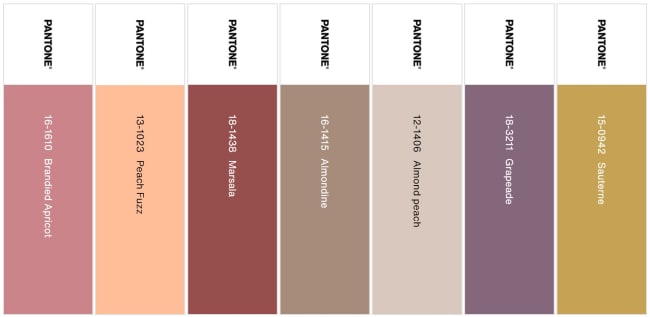
Pantone trend color 2024
Peach Fuzz, the Pantone trend colour 2024, which is reminiscent of a fruity cocktail, is currently on everyone's lips. As soon as the renowned US Pantone Institute announces its Colour of the Year, it is used creatively in a variety of ways by the fashion, art and interior design industries. We also use the warm nuance between pink and orange as a soft counterpart to cooler colours or clear shapes. Our planner Carolina Meseguer Girbés shows how.
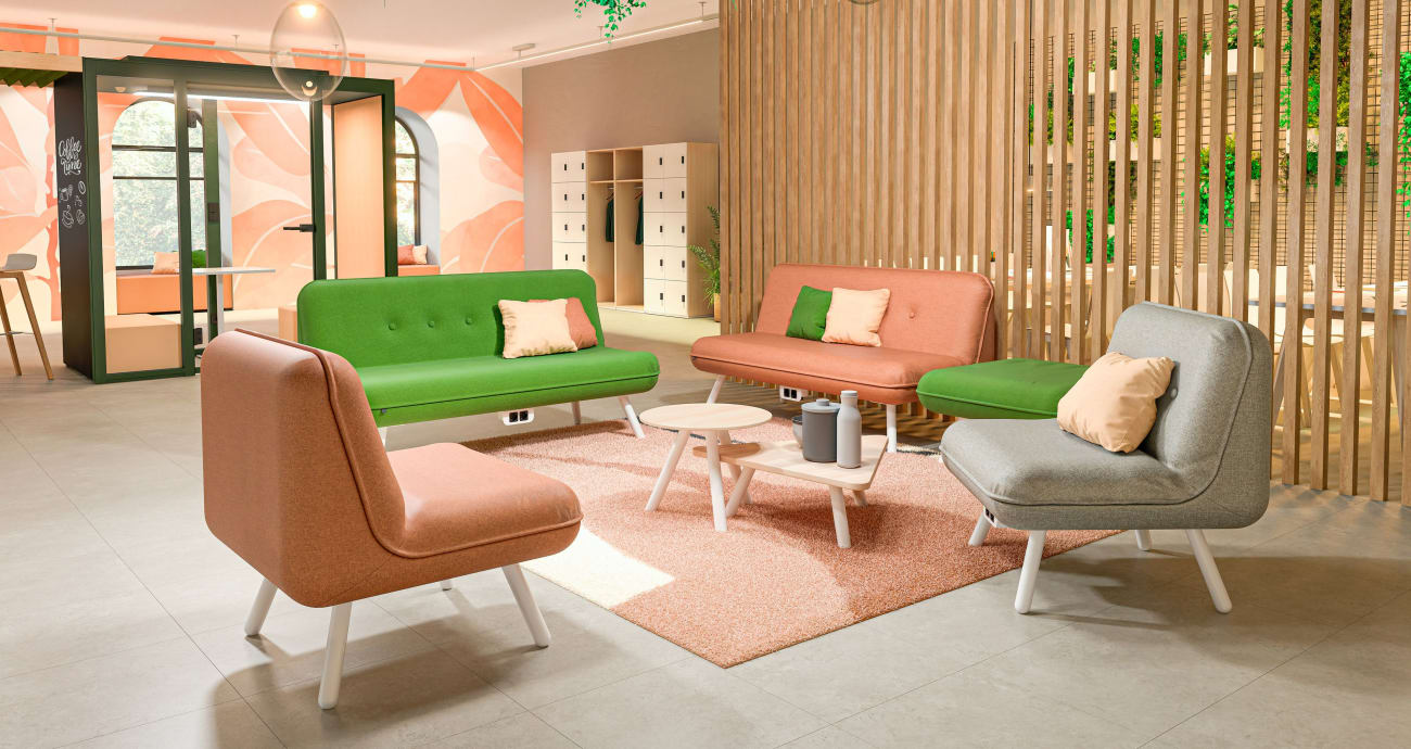
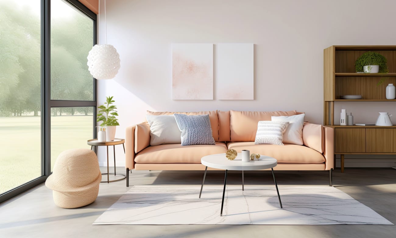
I use Peach Fuzz as a natural shade for the working world flow. The peach nuance is soft, light and calm. Peach Fuzz promotes relaxation in this lounge area and at the same time invites people to come together and exchange ideas.
Combined with grey, brown or red earth tones, Peach Fuzz looks soft and classic. With its lightness, it balances out darker stone nuances.
For example, we put together these colours and materials for our Flow working environment.
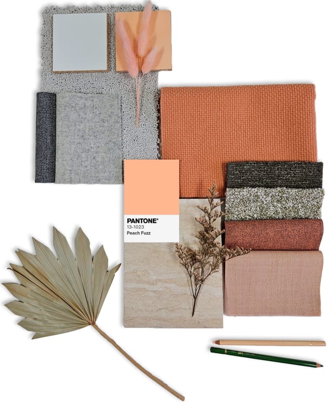
Good news for anyone who finds pink too romantic and beige too bland: peach or nude tones have a higher proportion of red and yellow pigments, transforming them into warm neutrals that look extremely modern with anthracite and black and more classic with colours such as beige or brown. "Even if I use the warm peach and blush shades in a rather monochrome concept, I can create a visual field of tension with different materials," says our interior designer.
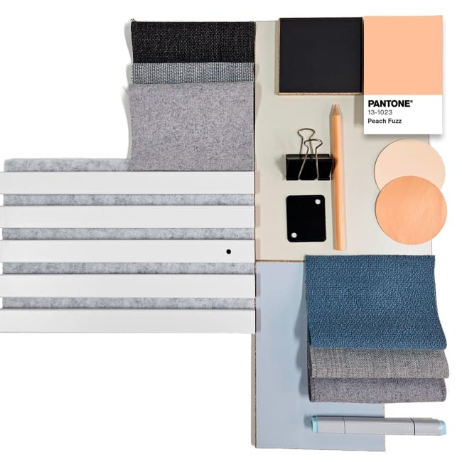
Our Pure working environment is designed to promote focussed working. That's why we usually opt for subtle colours and clean lines in Pure. However, a distanced anthracite, cool blue and neutral grey tones look even more sophisticated with a cosy peach. The fresh peach colour acts as a striking counterpart here, bringing a dose of warmth while still being discreet and calm.
Put colour first. This is what the trend scouts recommend and they are focussing on deeper tones. Delicate nuances such as peach fuzz intensify the effect of dark colours. Lush fabrics and a bold mix of materials can also be used, especially in cosy areas. I even see this in our Timeless work environment.
"Rich stone and sand tones convey stability and grounding in uncertain times. They will definitely be with us in 2024, as they bring warmth into rooms and surround us with an almost comforting softness," says our interior designer Carina Hölzer. Contrasts are provided by deep berry tones and natural colours. They also add interest with their interplay of surfaces, textures and gloss levels
Similar to the golden ratio, you can use the 60/30/10+S rule when using colours to achieve an optimum balance: