Interior design idea with Very Peri
Discover design ideas for your office
At the very beginning of this year our designers were working on concepts that incorporated the emerging colour trends. We asked them to predict how important Very Peri would be – and offer some insight on how the lilac shade can be integrated into the various design approaches and style collections at König + Neurath.
Our interior architect Carina Hölzer is convinced that the shade, which lies between blue and red, really does have the gift of being able to unite seemingly opposite aspects: “For me, the colour epitomises a wide variety of talents. I spontaneously envisage it in elements such as room dividers, where the colour choice inspires creativity – but also in lounge zones, evoking an atmosphere for both relaxation and brainstorming. With regard to the changing office environment, this nuance between blue and red is an effective embodiment of the hybrid culture we’re seeing in workplace models: a fusion of analogue and digital work, with allocated desks giving way to multifunctional zones.”
Very Peri in the TIMELESS style collection
“In our TIMELESS style collection, Very Peri brings a sense of balance into the mix, along with shades of green and radiant golden yellow. In spring I find it a perfect complement to the vibrant yet calm aspects of green – but it has a fresh, vitalising effect all year round. We are planning a coworking lobby, in which this aspect is further enhanced with the lush green foliage design on the walls and occasional splashes of green on the furniture,” explains Carolina Meseguer Girbés.
“The delicate lilac is counterbalanced with the intense ochre, giving it an almost regal presence,” stresses Carina Hölzer. “Anyone who likes an opulent, vibrant feel will be in their element here. It makes the breakout area into an inviting meeting hub that’s ideal for interdisciplinary dialogue. It helps generate a dynamic that facilitates collaborative experiences and results.”
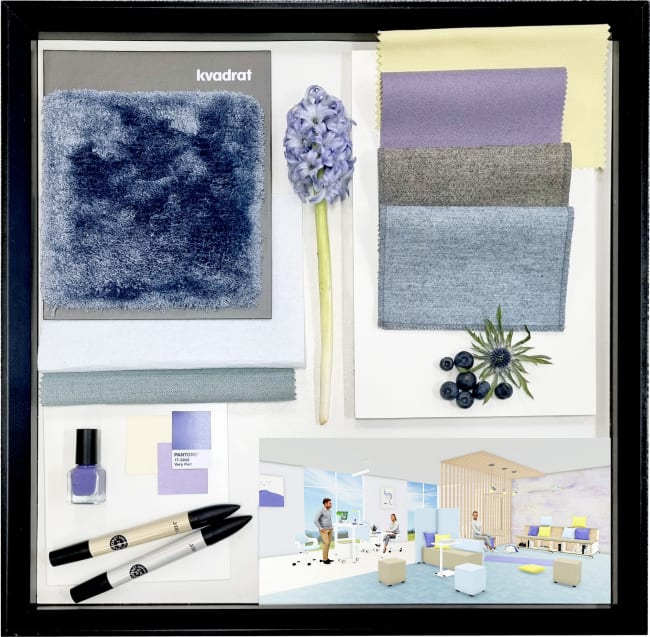
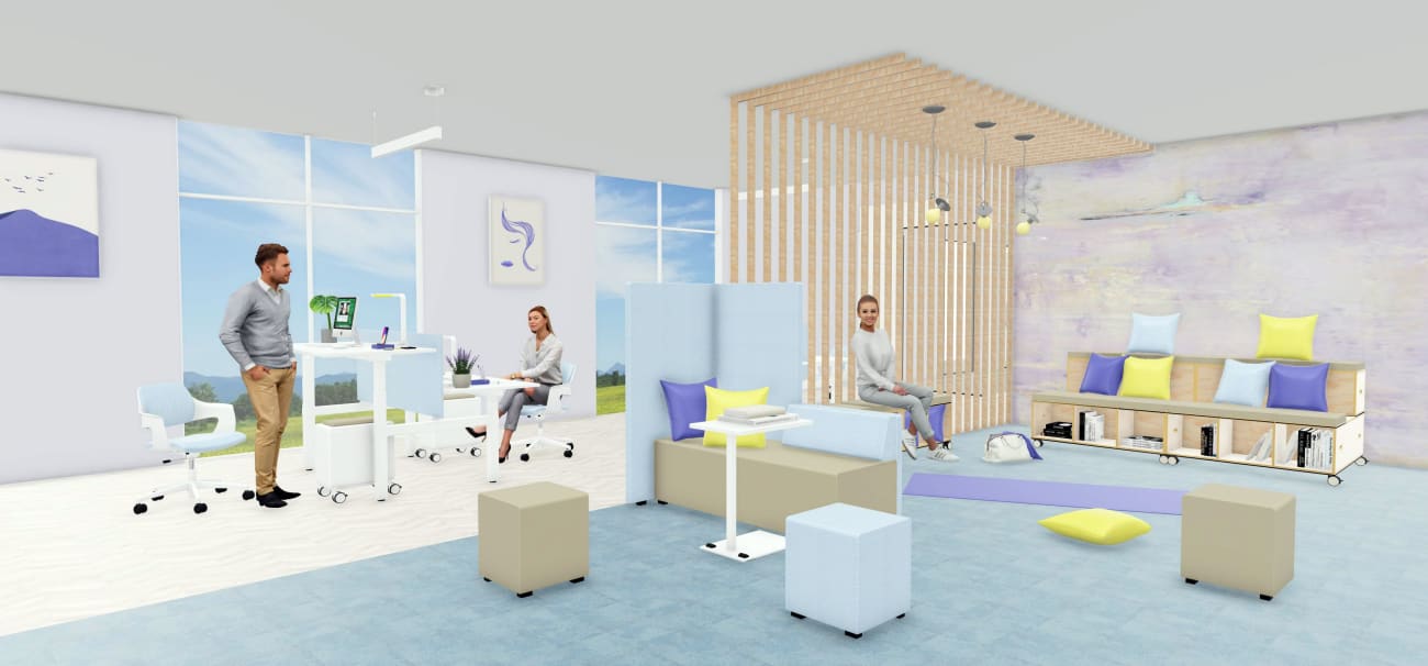
Very Peri in our PURE style collection
“Very Peri is an inspiring accent colour in this context, serving as a soft, fresh contrast to the bright yellow. Its pastel hue conveys a light, feminine quality. In the colour combination of lilac and yellow, which are exactly opposite each other on the colour wheel, the two shades augment each other for an intensely radiant effect. It combines well with other pastels for a welcoming, balanced feel – and goes well with sand and natural shades for an elegant look,” says Carolina Meseguer Girbés.
“Because it occupies this border territory, violet is often credited with mystical properties. It’s associated with transition and transformation: the women’s movement has used this powerful colour to symbolise female strength and intuition,” adds Carina Hölzer. “In the clear-cut design idiom of the PURE style collection, the colour underlines the functional aspects of this flexible and adaptable office situation. I see it as a fitting expression of the AGILE & HYBRID WORKING ethos.”
Sources used for this article:
https://www.pantone.com/eu/de/color-of-the-year-2022
Das Große Buch der Farben – Königsfurt / Urbania