Pantone Trend Colours 2021
The omnipresent shades of grey have barely been put to rest, references to the growing popularity of nature nuances are becoming more frequent – and suddenly divergent trends are popping up on the other side of the globe! This year, what we’re learning from the Pantone colour choice of the year is something that applies generally: there is no absolute truth. A variety of megatrends and tendencies can coexist peacefully alongside each other. Also the fact that the choice of the Pantone Color Institute included two colours illustrates that an array of options is something to celebrate in our age of collectivity.
The decision-makers at the institute, Laurie Pressman (Vice President of the Pantone Color Institute) and Leatrice Eiseman (Executive Director of the Pantone Color Institute) picked a duo of colours consisting of “Ultimate Grey” and “Illuminating”, a pale grey and a sunny yellow.
“The union of an enduring Ultimate Grey with the vibrant yellow Illuminating expresses a message of positivity supported by fortitude. Practical and rock solid, but at the same time warming and optimistic, this is a colour combination that gives us resilience and hope. We need to feel encouraged and uplifted; this is essential to the human spirit.”
These colours have already been seen in fashion collections by high-profile designers, replacing last year’s Classic Blue, which was more of a sombre shade.
PANTONE 17-5104 Ultimate Grey and PANTONE 13-0647 Illuminating are two independent colours that highlight how different elements come together to support one another. Practical, rock solid and optimistic – the combination of Ultimate Grey and Illuminating stands for strength and positivity. This story of colour tells of “deeper feelings of thoughtfulness with the promise of something sunny”. Here’s how it was described by the New Jersey trendspotting centre:
“The combination of PANTONE 17-5104 Ultimate Grey + PANTONE 13-0647 Illuminating expresses a message of positivity supported by fortitude that gives us hope. Belief in a better future is essential to the human spirit. As people look for ways to fortify themselves with energy, clarity, and hope to overcome the continuing uncertainty, spirited and emboldening shades satisfy our quest for vitality. PANTONE 13-0647 Illuminating is a bright and cheerful yellow sparkling with vivacity, a warming yellow shade imbued with solar power. PANTONE 17-5104 Ultimate Grey is emblematic of solid and dependable elements which are everlasting and provide a firm foundation. Like the colours of pebbles on the beach that stand the test of time, Ultimate Grey quietly assures, encouraging feelings of composure, steadiness and resilience.”
We asked our interior architect Carina Hölzer to take us behind the scenes and show us some actual examples of how these two fashion shades can be combined to create an effect in the office. “The combination of yellow and grey is a synergy that looks very classy. Both colours complement each other in their effect: the yellow seems more radiant, while the grey comes across as a solid and calming basis.”
König + Neurath working environments in the new trend colours
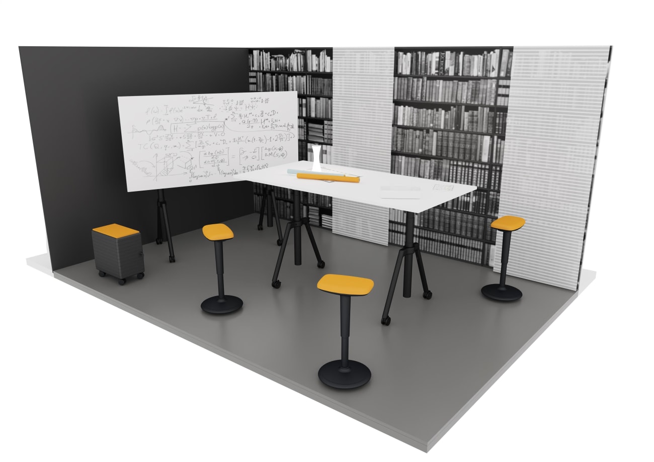
Inspired by the PURE style collection
“Cheerful communication in grey and yellow” is the principle for Carina Hölzer, when she’s designing a meeting zone in the Pantone colours. The idea is for the colour to support focused working and provide clarity to encourage a logical exchange of ideas. In this context the colour yellow dictates the theme of sitting and standing, embodied by our sit-stand support QUICK.III. The photo wall in the form of a stylised bookshelf is a subtle visualisation of knowledge transfer, while the acoustic textile panelling – used here as a sliding unit – lends the requisite homely feel.
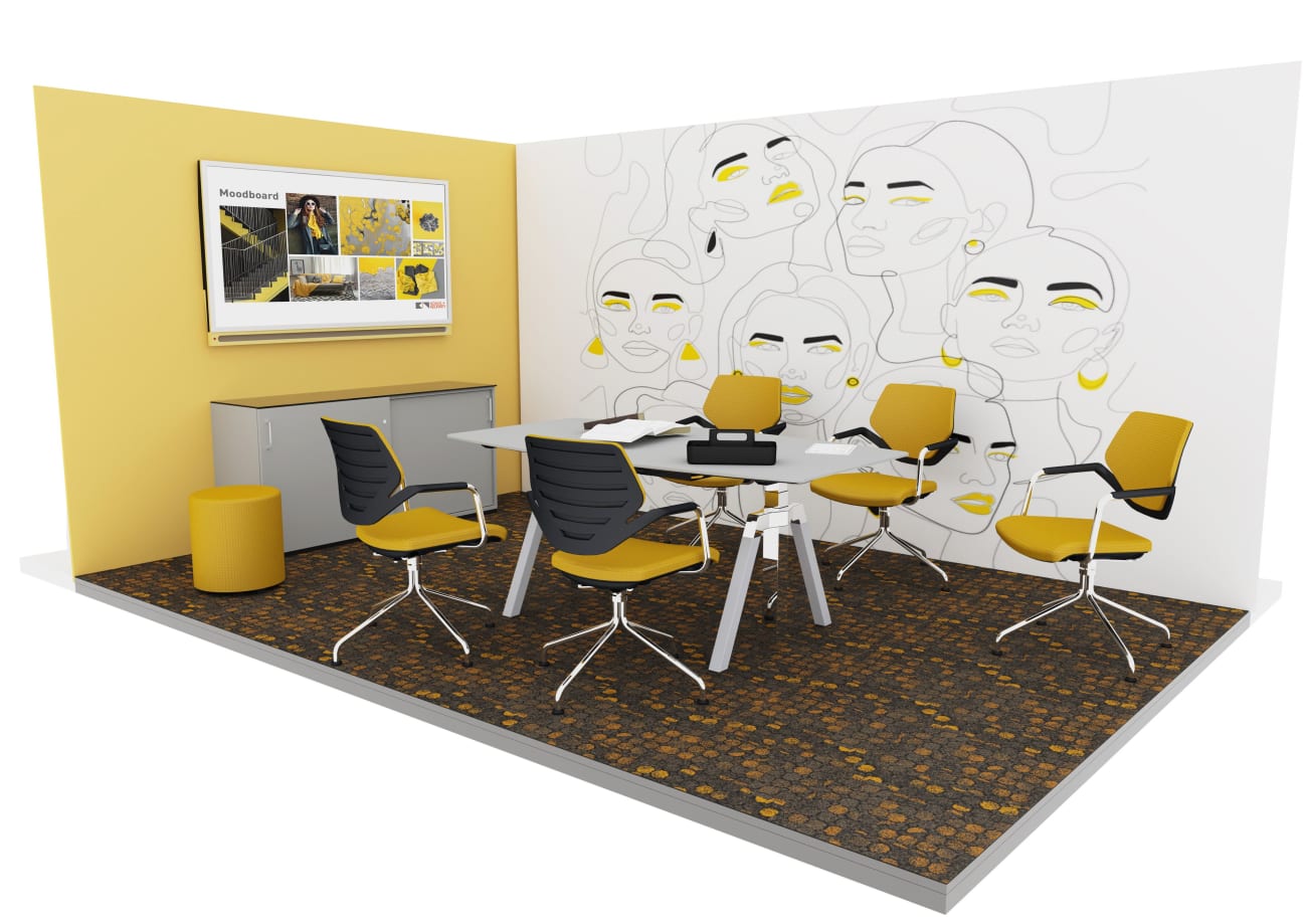
Inspired by the TIMELESS style collection
Carina Hölzer describes a meeting room designed around the Pantone colours as an embodiment of “timeless elegance and joyful synergy”. The combination of yellow, grey and chrome conveys a classy, friendly and neutral vibe. Nothing is so dominant that it distracts from the essential focus. The wall, which in this scenario features a facial art design, has echoes of Surrealist artists like Matisse and Picasso whilst at the same time inspiring creativity. Our new K+N NOOK conference chairs, shown here in yellow and chrome, are shaped to give a light, clear impression.
This feature was inspired by:
ANNOUNCING THE PANTONE COLOR OF THE YEAR 2021, Pantone 17-5104 Ultimate Gray + Pantone 13-0647 Illuminating, A marriage of color conveying a message of strength and hopefulness that is both enduring and uplifting, Https://www.pantone.com/color-of-the-year-2021, last accessed: 23.02.2021
Hobbs, Julia (2020), Pantone’s Chic Colour Duo For 2021 Is Here To Brighten Your Wardrobe (And Spirits), 9th December 2020, https://www.vogue.co.uk/fashion/article/pantone-2021, last accessed: 23.02.2021
Wikipedia (2021), Pantone Matching System, 17. Januar 2021, https://en.wikipedia.org/wiki/Pantone, last accessed: 23.02.2021